HOLA CUBA
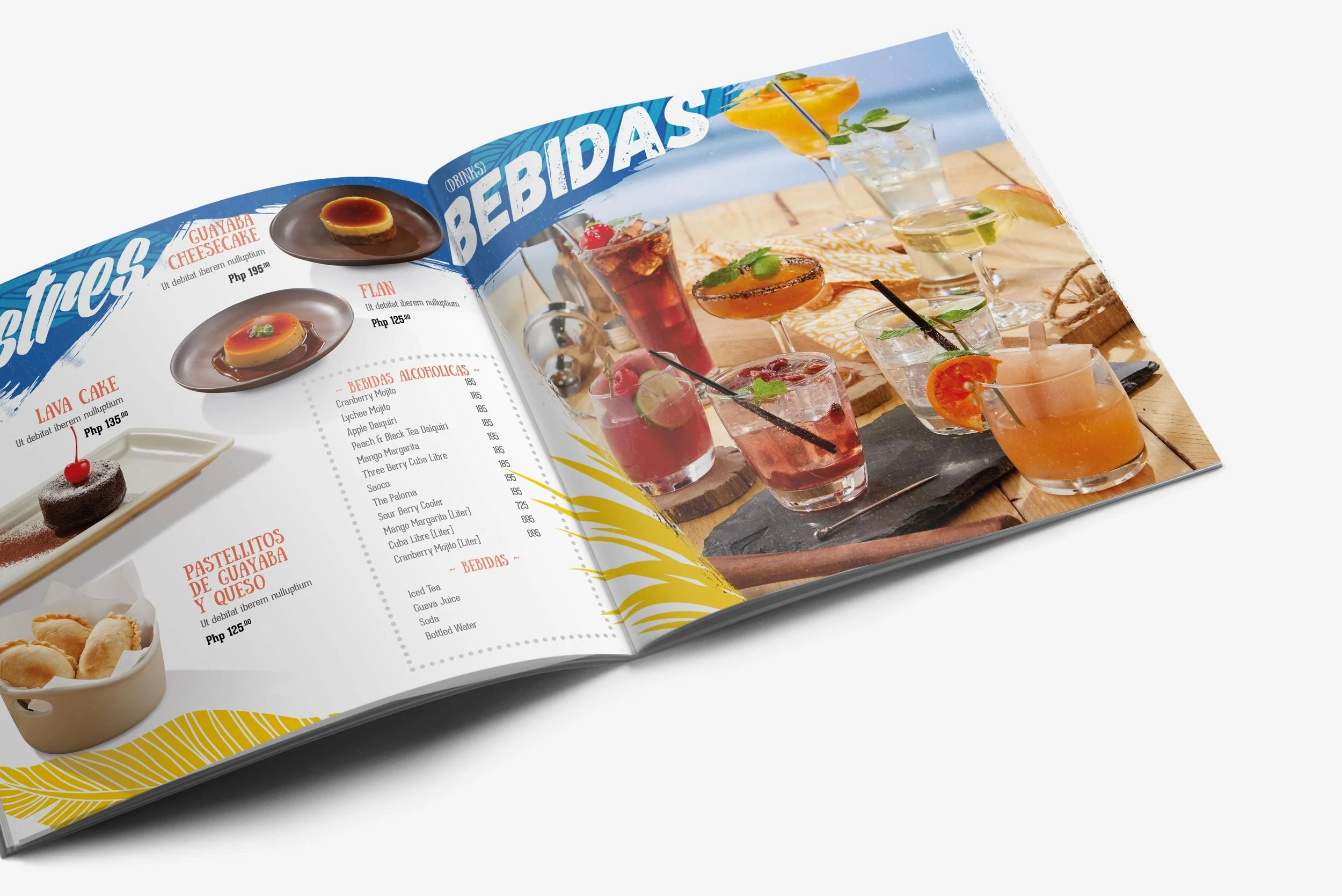
Bold, bright, and standout colors. The embodiment of this menu design is an homage to the artful and lively culture of Cuba, with layered tropical elements and high contrast gradients mixed with big and loud hand typography. The layout is a mix of pseudo-random gridded design and large group photos to contrast each other.
The design discipline was soon after cascaded into the brand’s marketing identity for poster, flyers, in-store and off-store materials, and digital.
Client: Pepi Cubano Philippines
Art & Copy: Ikie Binoya
Photography & Styling: Ikie Binoya